Where Does Box Plot Shines?
While histograms are great, they are inefficient when comparing multiple data sets. Substitute histograms for box plots and new patterns emerge.

I am a software engineer with over two years of professional experience. I specialize as a backend engineer but also work in full-stack capabilities. I use JavaScript/TypeScript, Python, and PHP to solve real-world problems every day.
Here are some benefits of using box plots over histograms:
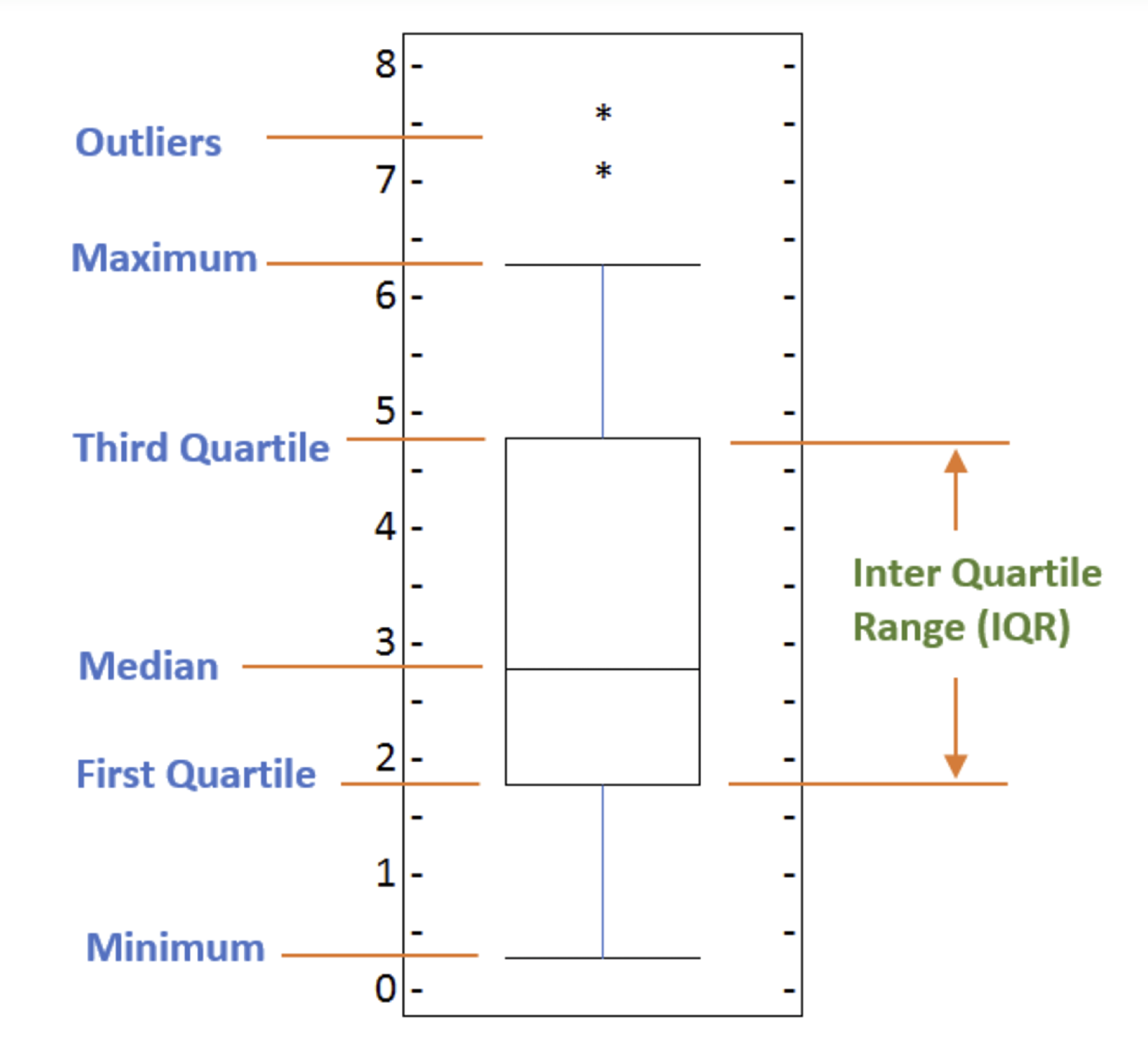
Below is a box plot in case this is the first time you have heard of it:
Comparing Multiple Data Sets
Box plots are particularly useful when you need to compare the distribution of multiple data sets side by side. They provide a clear visual comparison of medians, quartiles, and potential outliers across different groups, as you can see from the diagram above.
In trading software, for example, box plots are used in the following ways:
Visualizing Price Distributions: Box plots can be used to visualize the distribution of asset prices over a specific period. This helps traders understand the range, median, and variability of prices.
Identifying Outliers: Box plots help in identifying outliers in price data, which can indicate unusual trading activity or potential market anomalies.
Analyzing Trading Volumes: Box plots can also be used to analyze the distribution of trading volumes.
Dealing with Small Sample Sizes
When dealing with small sample sizes (also known as number of data points), box plots can be more informative than histograms. Histograms may not provide a clear picture of the distribution with limited data points, whereas box plots can still summarize the key aspects of the data.
Non-Normal Distributions
Box plots do not assume any distribution shape, making them suitable for non-normal distributions. They can represent data in various shapes and spread without the need for binning, which is required for histograms. See my previous article on plotting and interpreting histograms.
Disclaimer: On the paragraphs where I mapped out an example using trading software, it is important to note that I am neither an expert in trading nor do I know how to build one. Someday, I hope I will.